



GOOD LIFE CLUB
Brand Identity, Content Design
2025
PROJECT DIRECTOR
JEONGHAN LEE
굿라이프클럽(GOOD LIFE CLUB)의 브랜드 아이덴티티 디자인입니다. 굿라이프클럽은 러닝을 비롯한 일상의 다양한 활동을 기반으로, 특정 카테고리에 한정되지 않는 커뮤니티이자 라이프스타일 브랜드로 기획되었습니다.
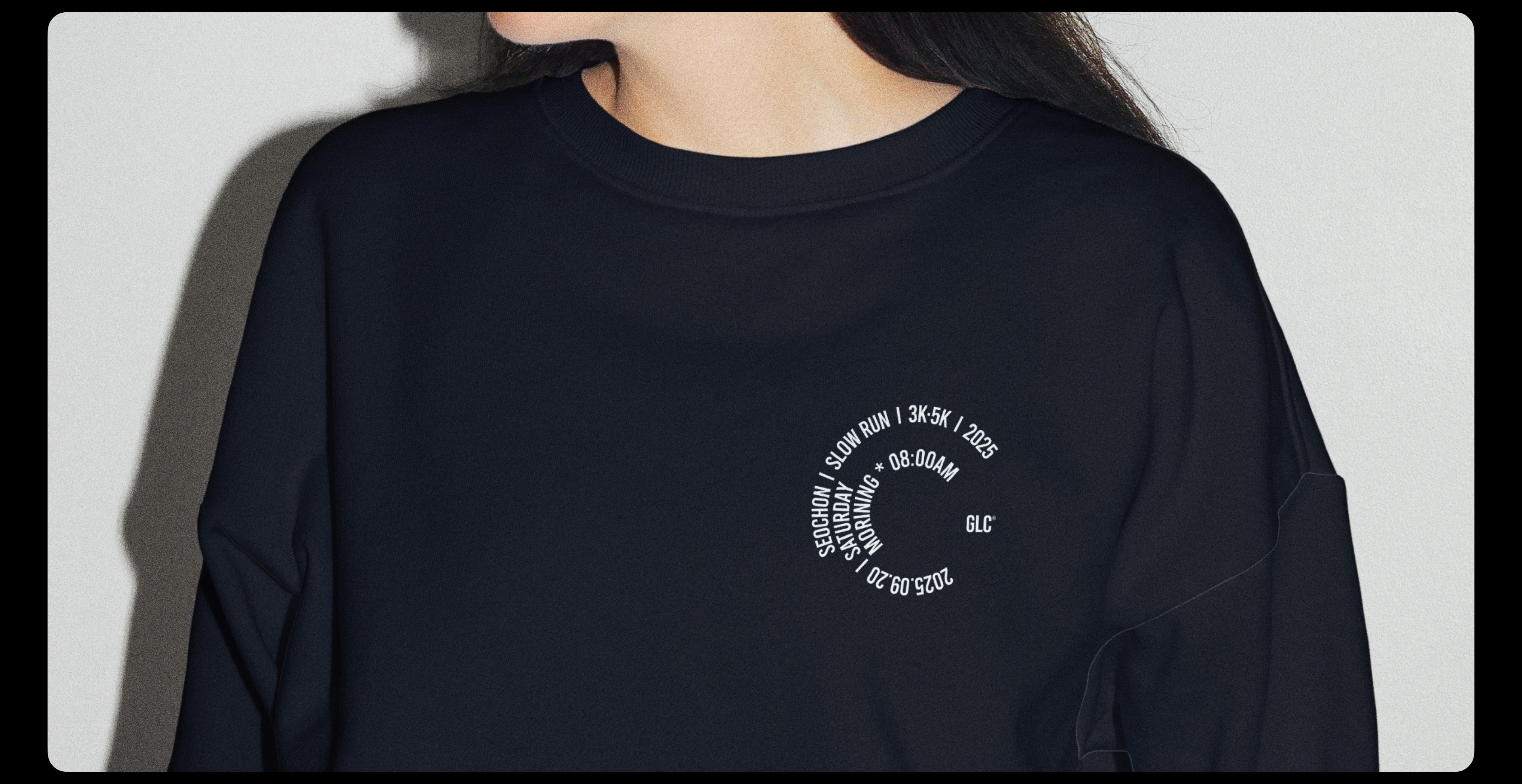
로고타입은 컨덴스드하고 볼드한 타입을 베이스로 개발하여 브랜드가 가진 에너지와 방향성을 시각적으로 담아냈습니다. 다양한 타이포그래피와 함께 각 활동을 상징하는 아이콘을 브랜드 그래픽으로 확장해 활용합니다. 브랜드 컬러는 활동별로 채도가 높은 원색 계열의 키 컬러를 하나씩 설정해 사용하며, 브랜드 포토와 그래픽에는 각 활동의 움직임을 모티프로 잔상, 블러, 노이즈 등의 효과를 적용해 생동감 있는 분위기를 만듭니다. 각 활동의 에너지와 움직임을 시각 언어로 확장해, 굿라이프클럽이 지향하는 역동적인 라이프스타일을 브랜드 경험으로 연결합니다.
This project presents the brand identity design for GOOD LIFE CLUB. GOOD LIFE CLUB is a community and lifestyle brand built around everyday activities such as running, designed to exist beyond a single category.
The logotype is developed based on a condensed and bold type style, expressing the brand’s energy and direction. Along with the typographic system, icons representing different activities are expanded and used as part of the brand’s graphic language. For the color system, a highly saturated primary color is assigned to each activity. In brand photography and graphics, visual effects such as motion trails, blur, and noise are used to capture the characteristic movement of each activity and create a sense of liveliness. By translating the energy and movement of these activities into visual language, the identity connects GOOD LIFE CLUB’s dynamic lifestyle philosophy with the overall brand experience.
GOOD LIFE CLUB
Brand Identity, Content Design
2025
PROJECT DIRECTOR
JEONGHAN LEE
굿라이프클럽(GOOD LIFE CLUB)의 브랜드 아이덴티티 디자인입니다. 굿라이프클럽은 러닝을 비롯한 일상의 다양한 활동을 기반으로, 특정 카테고리에 한정되지 않는 커뮤니티이자 라이프스타일 브랜드로 기획되었습니다.
로고타입은 컨덴스드하고 볼드한 타입을 베이스로 개발하여 브랜드가 가진 에너지와 방향성을 시각적으로 담아냈습니다. 다양한 타이포그래피와 함께 각 활동을 상징하는 아이콘을 브랜드 그래픽으로 확장해 활용합니다. 브랜드 컬러는 활동별로 채도가 높은 원색 계열의 키 컬러를 하나씩 설정해 사용하며, 브랜드 포토와 그래픽에는 각 활동의 움직임을 모티프로 잔상, 블러, 노이즈 등의 효과를 적용해 생동감 있는 분위기를 만듭니다. 각 활동의 에너지와 움직임을 시각 언어로 확장해, 굿라이프클럽이 지향하는 역동적인 라이프스타일을 브랜드 경험으로 연결합니다.
This project presents the brand identity design for GOOD LIFE CLUB. GOOD LIFE CLUB is a community and lifestyle brand built around everyday activities such as running, designed to exist beyond a single category.
The logotype is developed based on a condensed and bold type style, expressing the brand’s energy and direction. Along with the typographic system, icons representing different activities are expanded and used as part of the brand’s graphic language. For the color system, a highly saturated primary color is assigned to each activity. In brand photography and graphics, visual effects such as motion trails, blur, and noise are used to capture the characteristic movement of each activity and create a sense of liveliness. By translating the energy and movement of these activities into visual language, the identity connects GOOD LIFE CLUB’s dynamic lifestyle philosophy with the overall brand experience.